Typography

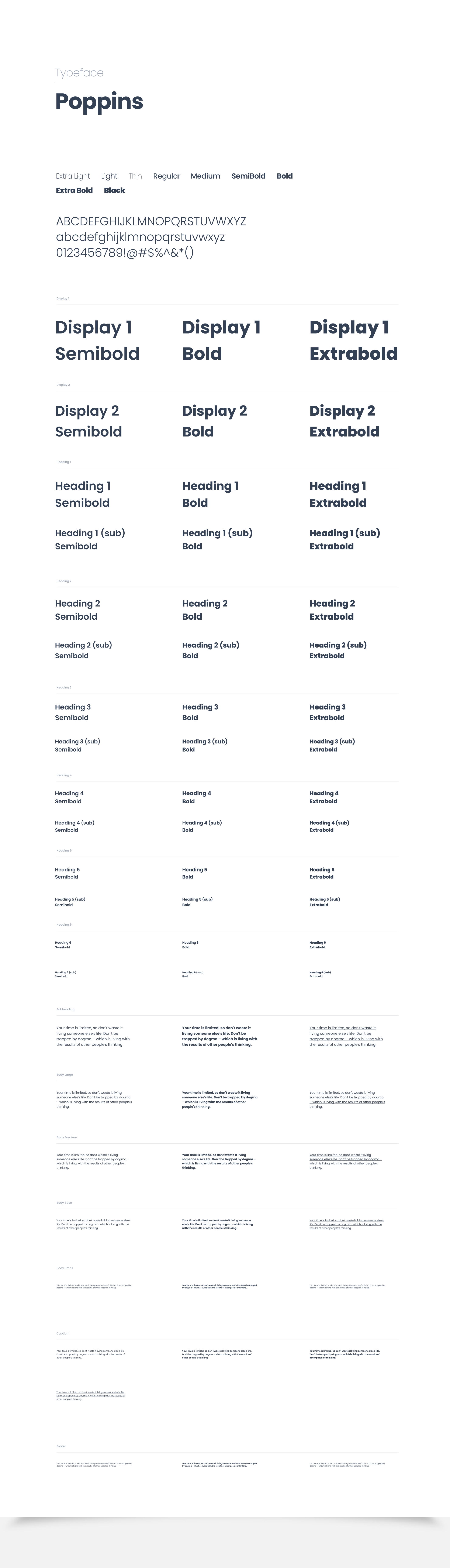
Typography is the art of arranging letters and text in a way that makes the copy legible, clear, and visually appealing to the reader which involves font style, appearance, and structure. The direct aim is to elicit certain emotions and convey specific messages. In short, typography is what brings the text to life.

Color

Color is a great way to impart vitality, provide visual continuity, communicate status information, give feedback in response to user actions, and help people visualize data. Look to the system’s color scheme for guidance when picking app accent colors that look great individually and in combination, and adapt well to accessibility and appearance modes.

Icons

Icons should be used in a purposeful manner to maximize comprehension and reduce cognitive load when you need to call attention to a particular action, command, or section. Icons are designed with brand personality baked in, aiming to balance our human side with function. As a general rule, icons should be used in combination with meaningful text to support users progressing through the product in an accessible manner.

Logos

A logo is a visual representation of a brand or product. It can be a word or an image, or a combination of both.

Grids

The grid is the foundation for positioning elements onscreen. Designing to the grid helps create seamless, easy to follow experiences.

Drop Shadows

Drop shadows with virtual lights help illuminate the UI. The shadows help the objects feel more 3 dimensional, creating that illusion of depth and less static.

Alerts

Alerts reminds people of a problem that has occurred and informs them what to do next.

Accordian

Expansion panels contain creation flows and allow lightweight editing of an element.

Buttons

A button triggers an event or action. They let users know what will happen next.

Sliders

Sliders allow users to make selections from a range of values.

Navigation

Navigation is the act of moving between screens of an app to complete tasks. It’s enabled through several means: dedicated navigation components, embedding navigation behavior into content, and platform affordances.

Tooltip

A tooltip is a floating, non-actionable label used to explain a user interface element or feature.

Badges

A badge is a visual indicator for numeric values such as tallies and scores.

Avatar

An avatar is a visual representation of a user or entity.

Notification Menus

Notifications provide short, timely, and relevant information about your app when it’s not in use.

Chat

Chat facilitates participation between one or more people, in a real-time conversation, typically as a series of short text exchanges, as instant messaging, or by using images, voice, video, or some combination of these.

Toasts

Toasts are primarily used for system messaging. They also display at the bottom of the screen, but may not be swiped off-screen.

Feed

A feed consists of a list of recurring elements of similar types. Examples of a feed would be a discussion feed.

Pagination

Pagination allows you to divide large amounts of content into smaller chunks across multiple pages.

Tabs

Tabs are used to organize content by grouping similar information on the same page.

Toggle

A toggle is used to view or switch between enabled or disabled states.

Modal

A modal dialog displays content that requires user interaction, in a layer above the page.

Drop Down Menus

A dropdown menu displays a list of actions or options to a user.

Cards

Cards are surfaces that display content and actions on a single topic. They should be easy to scan for relevant and actionable information. Elements, like text and images, should be placed on them in a way that clearly indicates hierarchy.

Data Tables

A data table displays rows of data with built-in pagination, sorting, and re-ordering functionality which might include a chart, diagram, picture, etc..

Input Fields

A text field is an input that allows a user to write or edit text.

Sign Up/ Login Pages

A signup page (also known as a registration page) enables users and organizations to independently register and gain access to your system. It is common to have multiple signup pages depending on the types of people and organizations you want to register.

Data Visualization UI Components

A chart, diagram, picture, etc. that is created as a visual representation of information.

Dashboards

A dashboard is a visual display of the most important information needed to achieve one or more objectives; consolidated and arranged on a single screen so the information can be monitored at a glance.

Modals

A modal dialog displays content that requires user interaction, in a layer above the page.

Tables

A table displays rows of data with built-in pagination, sorting, and re-ordering functionality.

Loading Indicators

Loading indicators tell users about wait times for current processes. Examples can include, searching through a page and submitting a form. These indicators communicate the status to the user.

Email Templates

Email templates allow you to customize the formatting and text of emails sent by users who share your content. Templates can be text-only, or HTML and text which can include images, in such cases the user's email client will determine which is displayed.